
New In-Game Layout!
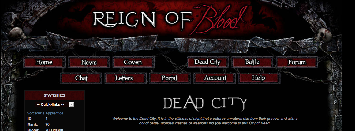
Reign Of Blood started in 2006 with a layout theme which is now called 'RoB-Lite' (A fan favourite.) In 2009 a new more graphical interface was created. Now that it's 2013, it's time for another one. This new layout is more geared to the current 'Gorgoyle Theme' users. RoB-Lite users still love RoB-Lite, and I wouldn't want to change that.
"Don't fix what ain't broke." A common feedback line. I personally am completely against it. Things can always be improved. So, what's different about this layout?
- New top header images, new side background, and new footer
- Has the same structure as before. So it feels new, but also very similar
- Few small changes to left sidebar, including new images
- Portal link added to the top navigation
- Main content area is a little wider to support 'wider' future features
- Game blog posts moved to top for easy viewing when new post is made
- Created with maximum compatibility with current profiles
I can also happily announce that I have removed Chill-Out from the top navigation on RoB-Lite and replaced it with the Portal.
You can change to any of the 3 themes on the account page at any time.
LAYOUT UPDATES!
Thanks for all the great feedback on the new layout! I have made a few changes and fixes, listed below:- Footer image now saved locally, and no longer appearing at the bottom of profiles
- Coven and house CSS issues have been resolved
- Made the red & green bar images a little brighter
Introducing, the new top info bar:
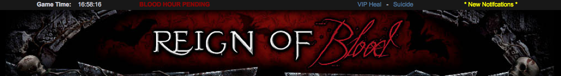
Using the new layout, you can enable this bar (it is on by default) which displays the game time, quick heal/suicide links, blood hour notification, and your general notifications (news, blood letters etc.) I hope you like this handy little addon. You can disable this by going to your account page.
A big thanks to Azzazel Aesculus for supplying the beautiful artwork for this new layout. Please continue to post any feedback or glitches on this thread, thank you!
September Competition Results
Thank you to everybody who submitted quest ideas last month. I've read through them all, and recorded all the ones I liked. I have given each of the top quest ideas 2 plasma each! You should see your quests (or quests based on your ideas) very soon.Halloween Profiles/October Competition Reminder
Halloween is soon upon us! Don't forget that this months competition to win plasma is to have an awesome Halloween profile! I've even got one. If you've entered into this months competition, then you might as well enter Mayne's competition as well, he's giving away some IG cash for the same thing.Google Checkout Shutdown/OneBip Issues
Just a heads up, early next month, Google Checkout are shutting down. (Which works out for the best overall, as they're a pain.) I have a replacement lined up, but I assure all the Google Checkout users, your card will work with REALEX. (Our recommended payment option.) More information next month. I am also aware of the problem some UK players are having with OneBip. My support request is still pending, but hopefully I'll get this fixed ASAP.Have a great week!
Ash


16 comments:
Whilst I can appreciate the work done, it no longer "feels vampirish," if that makes sense. :p After all, skeletons etc. are all good, however they don't manage to actually impart what we're here to do! :( Which is to drink blood, be vampyres ... and kill, kill, kill. I think I would prefer something closer to the old ... that maintains things like gargoyles which scream when a vamp is near (or any other demon for that matter) ... and the other things that go with vamps.
Love the new layout :) Thanks Ash.
I do have to add that I love the border; it's just the lack of vampy stuff that I don't care for. :( Thanks for all the hard work nontheless! <3
Haha I know what you mean. But you can't make it look too "vampish" without it being to much of a cliche. I really like the bats in the background of the header. I intend (as time goes on) to make the main content appear more "vampish". :)
lol ... Thanks Ash. As I said, I do love the borders! They ROCK!!! Pun intended. :-)
It looks amazing Ash! Thank you so very much for all the hard work you do. You're always going that extra mile, to keep us not only on our toes, but to also keep things exciting & looking fresh. I love the new look. Thanks for giving my eyes something new to see. :P
--Elizabeth Istrati/Mia Allen
While it all looks good, I am getting told that the new layout makes all the graphics disappear on the coven pages and apply page. :( Titania Darkshadow
It looks fresh and good.. except that the Coven Page graphics have been wiped out and lost.... by changing the CSS without warning us.
Thanks for fixing so many things Ash! ;) That rates a 10 in my book. :-) All you do to make the game smoother and fresher is worth that. *winks*
Loving the new top bar!
Please put the game time ect back on the left...having it at the top is driving me bonkers. I loved the new layout when I first applied it but now its not there...*pouts* Hope its just something you are playing with and will be fixed soon...
You can disable the top bar by going to account > top info bar
I personally think the graphics on the new layout aren't that great and look lazily done. Just my opinion.
Tried the layout for a day ad i have got to admit I think its the worst we have had.
The graphics are repetitive and none imaginative, the setting looks more like a scrap yard than a tumble down ruin (this better not be the metal mans doing) and where as i do like the new side bar I find the top bar annoying and pointless, almost like people ran out of room.
When f5'ing a page, healing and keeping my eyes on the time i don't want to be squinting to try and read that dull far our of the way bar but because of how its been added as just a slightly off black bar makes it look like a after thought.
So in short, I like the brighter look and the new side bar, everything else is a step back.
I see allot of people making coven profiles and personal profiles at far outstrip this and its a bit of a let down in comparison
I know you have tried to fit everything in and its not easy but as you said it was not broken does not mean it can't be improved but in my eyes its far from improved. .
Not everyone is going to love it like we do :) You can easily switch back to how it was before if its not to your taste. I give everyone the option to switch back! I don't make new layouts compulsory. Remember, you can turn off the sidebar and have the links and time back on the left by going to the account page.
Thank you for exchanging Chill-Out for the Portal! That rocks! I couldn't be happier about that change.
Also, please don't ever do away with the Lite version! Since I have dial-up only at my home, I use the Lite. It really saves me a lot of time.
Post a Comment
Comment this update.